
Rahul Hathwar · March 21, 2026
This article covers the UI engineering and design work I did on a KreekCraft-backed multiplayer Roblox game. The fishing and worker NPC systems for the same project are covered in separate articles.
This project is under NDA. I'm writing with explicit permission from the studio and covering exclusively the systems I personally owned in design and implementation. I've kept game-specific design details to the minimum needed for context.
Early in the project, I built a lot of the UI ground floor: the foundational component patterns like buttons, frames, tabs, and cards that the rest of the interface would build on. Then I went deeper into the specific features I'll detail in this article. Several of the design decisions here were also mine, not because they were formally handed to me, but because I saw what was needed and moved on it.
This article isn't just about what I built technically. It's also about how I navigated the combination of engineering, design, and initiative that this kind of work involves.
Building Without a Brief
Information First
In the early phases of a feature, before any design direction existed, my default was to design the UI around information availability. Not necessarily what a finished player-facing experience would display, but what the framework and technical aspects of things were actually capable of expressing. The intuition behind this is simple: if you show a designer only what you've already decided they should see, they have no way to know what else is possible. If you show them everything the system can surface, they can make informed decisions about what to keep, consolidate, or hide.
The worker card is a good example. It shows a worker's custom name, rarity, current state, active modifier, and the material context of whatever task the worker is undertaking. That's a lot per card. A finished player-facing design might compress most of it. But the prototype, by making all of it visible and navigable, gave the design side a concrete picture of the framework. What do we keep? What gets hidden? What gets consolidated? Those are the right questions to ask in a design review, and you need something real in front of you to ask them.
This proved useful repeatedly in a specific way. Designers would come to me with ideas framed as questions: "I was thinking we do X. I don't know if that causes a big rewrite or..." It's a fair concern. They don't know what makes the code tick, and they shouldn't have to. The early prototypes helped answer those questions before they were even asked, by showing the design side both what the framework could do and roughly how much would need to change to do something different.
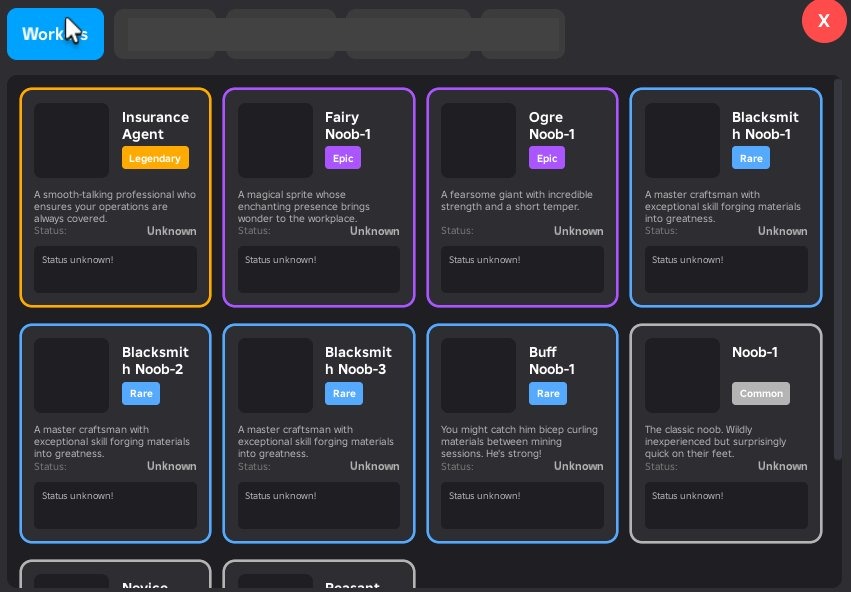
Early prototype design of the worker inventory page
Packet Contracts as the Foundation
The data that powers these views flows over ByteNet, a typed binary networking library. Every packet is defined with an explicit typed struct at the call site, with named fields and explicit sizes, rather than passing loose tables around the network layer. When the inventory changes, the client receives a versioned snapshot with typed slot arrays and rarity capacities per category. When a worker's state updates, the server sends a targeted delta packet, not a full resync.
That discipline at the network layer is what gives the UI layer its flexibility. If the packet contracts are clean and typed, the UI can be aggressively restructured without touching networking or data storage. The client always knows what it will receive. Rendering is just a question of which parts of that to show.
When They Actually Did Want to Change It
A Principle That Paid Off Unexpectedly
At some point in the project, one of our leads asked for a fairly significant change to the worker card display. The original design showed the granular FSM states of each worker: Mining, Transporting, Inventory Full, Waiting, and so on. (Unfamiliar with the worker system? Workers are player-controlled NPCs that carry out tasks around the game world — mining, fishing, transporting resources — and are observable through the inventory UI. The full system is covered in the Worker NPC System article.) The lead wanted to rethink this entirely. Instead of showing what the worker was doing step by step, he wanted to show the material the worker was focused on obtaining. Not what the worker was actively carrying at this second, but the high-level material goal they were pursuing. The reasoning was that most players don't need the minute details; they want to know which workers are working toward which materials.
On paper that sounds like a significant change. In practice it wasn't, because of a module called WorkerStateMapping.
That module's only job was to sit between the FSM states and the UI display layer, translating technical state machine values into human-readable labels and descriptions. It was a single file, and nothing else in the codebase depended on it directly. When the lead's request came in, the change was entirely UI-side: update what the mapping exposed and adjust the card rendering to display the material goal rather than the state label. The server, the FSM, and the network layer were all untouched.
I didn't design it this way because I expected this to happen. Honestly, I didn't expect it at all. I designed it this way because coupling the "how to display a state" logic into the rendering functions, or into the FSM itself, didn't make sense to me. State-to-display mapping is a transformation, and it belongs in a module that exists solely to perform it. That's a straightforward SRP argument, and it paid off in a situation I never anticipated. Standard principles earn their keep in non-standard situations.
The Exclusive Shop: Engineering and Designing It
Stepping Into Both Design and Engineering
The exclusive shop went through a revision at a point when the team needed it done quickly and didn't have a designer to take it on. I took on both the programming and the graphic design. I've been thinking about UI since I was a teenager, and I've taken formal university coursework in UI/UX design, so I had enough foundation to put together something real, not just a placeholder. I came up with the visual direction, gathered references, and set the art direction and styling myself.
The core design goal I set for myself was easy to state and harder to execute: show players what they can buy. That sounds obvious, but plenty of monetization UIs fail at it. Products buried behind navigation, things hidden under tabs that most players never find. I wanted the shop to present its catalog up front with minimal need to navigate. You open it, you see what's there.
Visual Structure as Communication
To prevent a full catalog from reading as a wall of undifferentiated cards, I leaned on the design fundamentals I know: layout, color, visual weight, hierarchy. The big-ticket items got wide, prominent cards that read as featured. Smaller purchases were organized into grouped sections with clear headers. Color carried meaning: the gold-toned cards signaled high-value featured items; the standard cards used a neutral surface. Section layout and color together communicated priority without requiring additional copy.
The technical implementation mirrors the design intent. Cards have two rendering modes: standard and wide. Wide cards rearrange their content layout horizontally to give the featured item more visual breathing room. Whether a card renders wide is determined by a cardSize config value on each product definition in marketplaceProducts.luau. Adding a wide card is a data change, not a code change. Hover states use spring-animated scale with a factor of 1.02, just enough to give feedback without being distracting.
Tab navigation in the shop uses scroll-position anchoring: selecting the Products tab preserves a reference to the first products section frame and uses its absolute position to jump the scroll canvas directly. There's no re-render or state change involved, just a canvas position update. It's a small detail that keeps the interaction feeling immediate.
The Mobile Build Controls: A Mockup in Five Minutes
Identifying an Unaddressed Mobile UX Problem
When I looked at the build controls as they stood, the situation was clear: there was no visual control system at all. Building — placing structures like houses and decorations on a player's plot, and being able to move and rotate them freely — followed the mouse on desktop with no visual affordances at all. Rotation happened via keybinds. For desktop players who already knew the controls, it worked. For mobile players, it simply did not. And honestly, even for desktop players, keybinds as the only interaction method is a problem. New players shouldn't have to discover actions from a help screen. Visual affordances are just more natural and more forgiving than anything that requires memorization.
I always try my best to step back and view projects under multiple lenses. The lens of engineer. The lens of a designer. And most importantly, the lens of a player. As I spot issues, I flag them and proactively work towards a solution.
Ideate, Build Fast, Get Feedback Faster
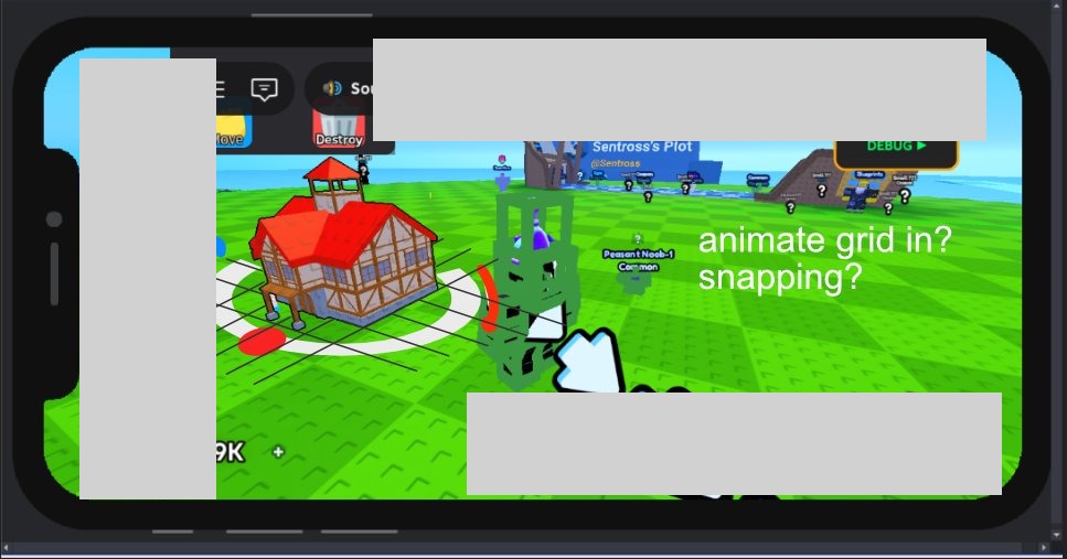
I opened Affinity Designer, took a screenshot of the current build mode, and drew directly on top of it. A white ring sitting around the preview model at ground level. A red dot on the ring that the player could drag to rotate. A snap grid underneath to communicate placement precision. A move icon in the center. That sketch took under five minutes. I brought it into a meeting, explained the idea in the same amount of time, and got the go-ahead.
This is a principle I come back to constantly. Taking initiative on your team doesn't mean disappearing for a week and surprising everyone with something finished. It means communicating more, not less. A rough mockup in a meeting is infinitely more useful than a verbal description. It makes the idea concrete enough to evaluate. It keeps the cost of approval or rejection low on both sides. If the team said no, the cost was five minutes and a sketch. Because they said yes, I could proceed with confidence.
What Got Built
The implementation turned out to be more involved than the mockup suggested, as implementations usually are.
The ring is a Part in workspace with a SurfaceGui attached, parented to PlayerGui with the part as the adornee. Roblox handles the 3D hit test so when the player taps the red dot, InputBegan fires on the ImageButton naturally. The ContextActionService handler runs at priority 3000, above the camera's default priority of 2000. This means every touch input arrives at the build handler first, and I decide whether to sink it or pass it to the camera. That sequencing is important: without it, dragging the model would cause the camera to pan simultaneously.
The snap grid is built from BasePart lines that animate in with staggered tweens when build mode activates. They appear in sequence across the floor, then fade out when build mode ends. It's a polish detail, but it makes placement feel deliberate rather than arbitrary and it cements the visual communication of the ring.
The move icon in the center is a billboard that also serves a secondary function on PC: when the mouse hasn't moved for a configured idle threshold, the icon expands slightly as a visual hint. First-time PC players get a subtle cue that this element is interactive.
Stuck-state safety is also built in. Each RenderStep, the handler checks whether any tracked InputObject is still reporting an active state. If the OS cancelled a touch without going through the normal CAS end path, the gesture clears automatically. This guards against a class of bugs that are nearly impossible to reproduce reliably in Studio but can appear on real devices.
Responsive by Breakpoint, Not by Accident
Every User Gets a Designed Experience
In many scenarios, mobile compatibility, whether it be UI or other mechanics, end up being second-class with bare bones compatibility as the only goal. The experience of actually using them is usually somewhere between tolerable and bad: everything either too small to tap or too large to navigate, because the UI was designed for one viewport and then run at a different size.
I wasn't satisfied with that, so I built a breakpoint-based responsive layout system. At specific viewport width thresholds, layout variants switch rather than scale. The inventory rarity sections, for example, use 64x64 item cells on narrow viewports and 70x70 on wider ones. That specific number isn't the point. The point is that each screen size gets a layout that was designed for it, not one that merely tolerates it.
Nobody asked for this. And not because it's unimportant, but because the reality is that not every detail of every task can be accounted for in planning. At one point, one must be self-sufficient. I looked at the UI on a smaller viewport, decided the experience was worse than it needed to be, and built the solution. I have screen recordings of the UI adapting across viewport widths in real time.
How It Works in Practice
The technical pattern is a reactive source that tracks the current camera viewport width. A derived value maps that to a breakpoint tier. Layout properties anywhere in the component tree that care about screen size subscribe to that derived value and update automatically. Components that don't need to know about screen size don't have to know about it at all. Because the whole UI is built in Vide, a reactive state library, the breakpoint value propagates through the component tree without any manual plumbing or prop drilling.
The Hover Reveal Pattern
A UX Gap That Wasn't Anyone's Ticket
The worker card and the boost card had the same structural problem. Both cards were fully dense with information: name, rarity, state or multiplier value, quantity badge. No room left on the card face for a button representing the primary action. The worker card's action was grabbing the worker to throw it. The boost card's action was consuming the boost to activate it.
The problem isn't that players couldn't figure this out. Some would click, find the action, and move on. But "click and discover" is a worse experience than "see and understand." New players especially deserve to get a clear signal that these cards are interactive and what interacting with them will do.
I noticed this, and then took on the initiative to implement a solution.
One Insight, One Session
Because the two cards share nearly identical visual structure, both solutions came from the same insight at the same time, and I built both in the same sitting.
On hover, a semi-transparent overlay fades in over the lower portion of the card with a labeled action button: "Grab" on the worker card, "Consume" on the boost card. The fade transition is spring-animated with a period of 0.08 seconds. Fast enough to feel immediate, smooth enough not to feel abrupt. The information is present when you're paying attention to the card; it stays out of the way when you're not.
The prototype took under ten minutes to build. I showed it to the team. They liked it. If they hadn't, removing it would have taken about five minutes. That attention to timing is what makes fast prototyping worthwhile. The cost of a rejected initiative is proportional to how quickly you built it. When the build time is short, you can afford to have ideas that don't land.
What This Was For
Engineering and Design as the Same Instinct
The systems in this article all live on the UI layer, but they pull from very different places. The packet contracts reflect how I think about network architecture and what good data hygiene looks like across a boundary. The state mapping module is a software design decision that happened to absorb a requirements change months later without touching anything else. The exclusive shop was as much a visual communication problem as a programming one. The build controls went from a five-minute sketch to a fully built feature. The hover reveal was a UX observation that cost ten minutes to prototype.
What I find interesting about UI work specifically is that it involves all these factors at once. The engineering decisions at the foundation determine how changeable the surface is. The design decisions at the surface determine how usable the whole thing is. Separating those two concerns in your head is useful when you need to reason about one of them, but in practice they tend to come from the same underlying instinct: caring about the quality of what you're making on both ends.
This project was a successful run of that. The early prototypes gave the design side extensive, but useful context to work from and opened up the conversation about what was possible. The middleware patterns absorbed an unexpected requirements change without rippling across the codebase. I took on the shop design from visual direction all the way through to pushing code. I built the mobile controls because I saw they were needed. I built responsive layouts because I wanted every player to get an experience that was actually designed for their screen, not one that merely ran on it. All of these are examples of conscious decisions that paid off in the long run.
The worker NPC FSM, locomotion, and network systems are covered in the Worker NPC System article. The river flow and fish visualization systems are covered in the Fishing and River System article.